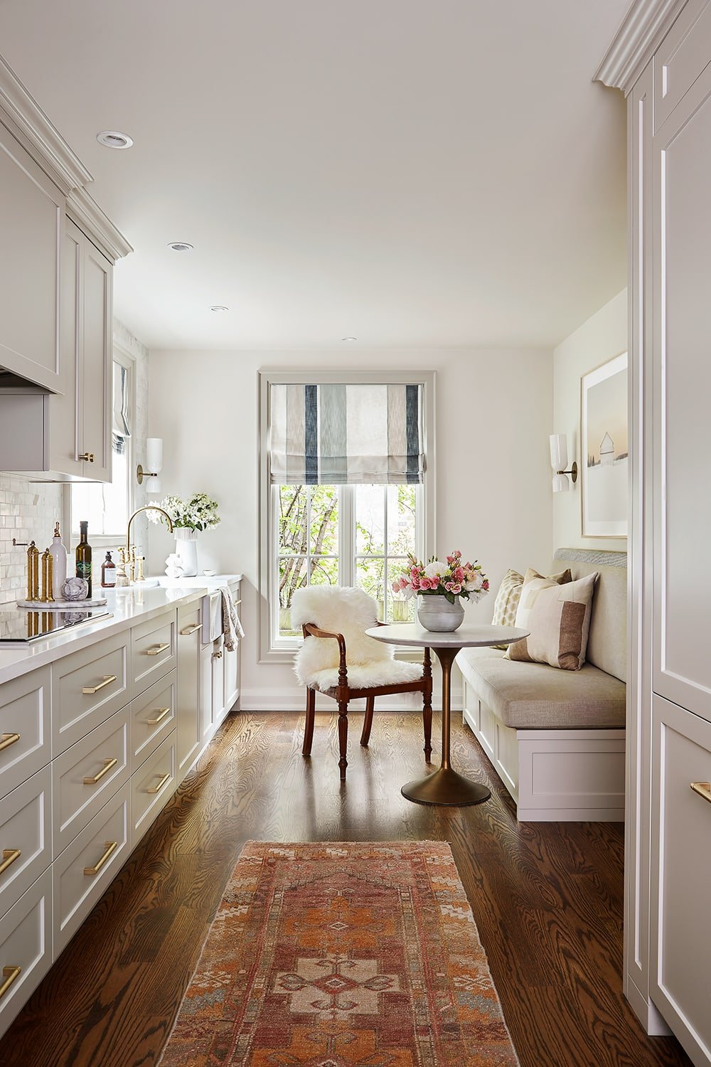
When they were ready, they entrusted Griffin Houghton to help make the new kitchen not only beautiful, but the renovation as seamless as possible.
Their home is perched at the top of an idyllic ravine setting in North Toronto, so one of the first things we discussed was the idea of bringing in more natural light with a few strategically placed large windows that offer views of the outdoors (and of the wildlife that Brian loves to watch and shoot as a talented photographer).
|
|
For the kitchen style, Janet and Brian wanted a classic design that would age well – something fresh and inviting. They’re not formal people, but there is an understated elegance about the kitchen design that reflects their style to a tee.
We designed an entirely new layout to give Janet more room to do her cooking and baking in and with much more storage. Then, we expanded the openings between the kitchen and the living and dining rooms to create better flow.
|
|
Brian enjoys hanging out with Janet when she cooks, so we designed a cozy banquette with drawers underneath for those less frequently used things like holiday platters or the fondue pot that gets pulled out twice a year. And who doesn't love a banquette?
The rest of the kitchen was carefully considered for functionality with two-in-one drawers that double the storage capacity for items like cutlery, spices, and cooking utensils.
Warm, medium brown oak floors – a continuation of what they already had in the rest of the home – add to the character and connects the kitchen to the other rooms seamlessly. Nothing feels as good under foot in a kitchen as hardwood floors, so we often recommend them to our clients.
|
|
We created a breakfast station hidden behind closed doors that when open, slide into pockets to get out of the way. The breakfast station is used every morning when Janet and Brian make their coffee and toast. The fridge is placed conveniently beside it and hidden behind custom cabinetry to blend in with the rest of the kitchen design.
|
|
Every inch of this kitchen was thoughtfully designed to be both beautiful and functional. The large apron sink is not only pretty looking, but great for cleaning large platters. Paired with an unlacquered brass faucet by Perrin & Rowe, the whole sink area brings tons of character, patina and English style into the mix.
At the end of the day, Janet and Brian absolutely love their new kitchen. It was worth the wait and maybe even sweeter for it.
|
|
Designed & Styled By: Stephanie Houghton Photography By: Ashley Capp Art By: Martine Côté
|
|
|